
Excel 2000 -
Editing Charts

Excel 2000
Editing Charts

search
menu
/en/excel2000/moving-resizing-and-deleting-charts/content/
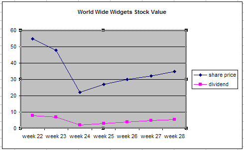
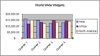
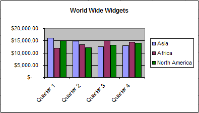
When you add a chart to your worksheet, Excel creates a link between the chart and your source data. This way, any changes you make to the original source data are instantly reflected in your chart.
You can also add rows or columns of data to an existing chart by selecting Add Data on the Chart menu.
 Add Data.
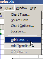
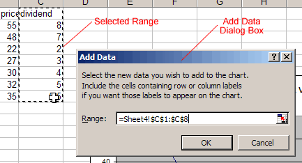
Your chart should update to display the new data.
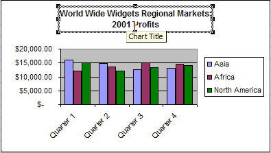
Be sure to select a meaningful title for your chart.
In addition to selecting the right title for your chart, you can use the Format Chart Title dialog box to apply several types of formatting, including:
 on the Chart toolbar, or double-click the chart title.
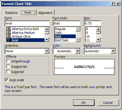
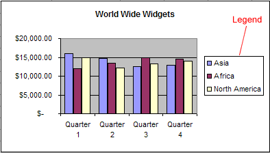
The chart legend displays useful information. Be sure to format the legend so it is as clear as possible.
 on the Chart toolbar. on the Chart toolbar, or double-click the chart legend.
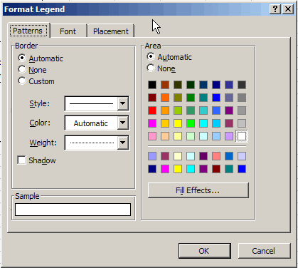
![]() The only way to change the actual text of the legend is to make changes to the source data.
The only way to change the actual text of the legend is to make changes to the source data.
You have several options when formatting the value and category axes of your chart. In addition to changing font, color, and style, you can adjust the numbers on the scale of the chart.
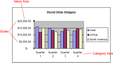
on the Chart toolbar, or double-click the chart axis.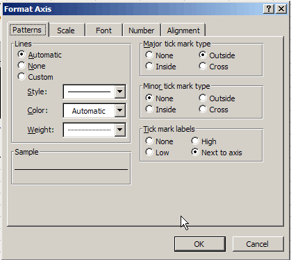
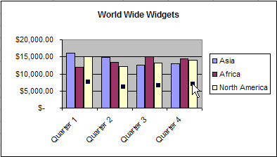
![]() You can also use the angle axis buttons
You can also use the angle axis buttons  on the Chart toolbar to change the angle of the value and category axes.
You can apply formatting to each data series of a chart. Although you can change different aspects of each data series, you will probably find that you change the color of bars, columns, pie slices, and areas most often.
on the Chart toolbar, or double-click the data series.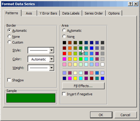
Your chart should display the new colors.
/en/excel2000/using-the-page-setup-dialog-box/content/