Basic CSS -
Organization and Sizing in CSS

Basic CSS
Organization and Sizing in CSS


/en/basic-css/cascading-specificity-and-inheritance-in-css/content/
On most webpages, one of the first things you'll want to do is create a customized layout. Fortunately, CSS provides declarations to help you alter the basic organization of your HTML elements on the page, as well as the sizes of each element.

One of the most essential tools CSS provides for organizing a webpage is the display declaration. Every HTML element has a certain display value by default, and they correspond to the basic block-level and inline organizational behaviors we discussed in the HTML tutorial. For example, a block-level element like <p> has a default display value of block, while an inline element like <a> has a default display value of inline.
With the display CSS declaration, you can change those default values. For example, imagine that you wanted to make a list of links to your favorite websites. First, you might put together a few <a> elements:
<a href="https://edu.gcfglobal.org">GCFLearnFree</a>
<a href="https://edu.gcfglobal.org">GCFLearnFree Again</a>
<a href="https://edu.gcfglobal.org">GCFLearnFree Once More</a>
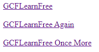
If you were to load that on a webpage, you'd see a series of links all in a single row:

Maybe you want to stack them vertically, though, so that it looks more like a list. To do that, you could leave the HTML exactly as it is, but create a ruleset that uses the display declaration to change the default behavior of the <a> element to block.
a {
  display: block;
}
Now that webpage would show a series of vertically stacked links:

Another powerful function of the display declaration is the ability to hide elements altogether. By giving the declaration a value of none, you can keep elements from being visible or taking up any space on the screen when you load them on a webpage. Elements that have been set to display: none; are still there—if you were to view the page source or use your browser's inspector tool, you'd be able to find them—but in the visible display of the webpage, they're gone.
The value of being able to hide elements with CSS will become much more apparent once you begin working with JavaScript. For now, just keep in mind that there is sometimes more HTML than you realize on any given webpage, because CSS can be used to hide it from sight.
To better control your webpage's layout, you need to be able to alter the sizes of your HTML elements as well. There are multiple ways to do so—some we'll get to later on—but two of the most straightforward methods involve directly changing width and height.
The CSS width declaration can be used to set a specific width for an HTML element. The declaration can be used with a number of different values, like pixels (px), percentages (%), and others, just like the font-size declaration before. Again, though, we'll be focusing on pixels (px) for simplicity's sake. For example:
width: 100px;
Every HTML element has a certain width by default, depending on the display type of the element. For example, a <p> element is a block-level element, so by default, it will take up all the width available to it. An <a> element, on the other hand, is inline, so it has a flexible width and only takes up the space necessary to show the text inside.
Imagine that you have a <p> element on a webpage. Let's pretend you've given it a background-color CSS declaration of lightblue as well, just to make it easier to see. By default, your <p> element would take up all of the width available to it, like so:

However, you could also tell it how much horizontal space to take up by using the width declaration. For example, let's say you added width to your existing ruleset:
p {
  background-color: lightblue;
  width: 200px;
}
Now you have the same p element with the same contents, but only taking up 200px of horizontal space, rather than all the available space.

Because inline elements are meant to flow seamlessly within a single line, sizing declarations for width and height don't work on them as they do with block-level elements. However, keep in mind that the display declaration allows you to change that status on any given element.
Height
While the width declaration allows you to set a specific width for an HTML element, the height declaration does the same for height. It uses the same values as width—pixels (px) or percentages (%), for example—but is noticeably different in its default behaviors. Whether an element is block-level or inline, its default height is determined only by the height of its contents.
For example, imagine you're working on some sort of blog post. You've already got a couple of paragraphs in place:
<p>The Cinema Classics review of Basketball Dog is way off the mark. The movie is unrealistic, because dogs can't play basketball. Trent Dugson's performance is terrible, and I don't understand why director Vicki Fleming found it necessary to use a CGI dog in almost every scene. It should be rated 1 out of 5 stars.</p>
<p>Please subscribe to my newsletter so you can hear more of my thoughts on the Basketball Dog extended universe.</p>
Now imagine you wanted to put a divider between those paragraphs, given that you know how to add colors. Maybe something like this:

One solution would be to add a background-color declaration to a <div> element with nothing in it. It doesn't have any text content, after all; it just needs to take up space. If you add an empty <div> element between the two paragraphs and give it a background color, you still won't see anything on the page, though.
That's because this particular <div> doesn't contain anything. Its default height wants to match its contents, and it doesn't have any contents, so its height is nothing. All we have to do, then, is give that <div> a height value:
div {
  background-color: #DDD;
  height: 5px;
}
And now your divider will have some weight to it:

Try adding each of these declarations to the input below:
background-color: #00ACD7;
color: white;
width: 200px;
height: 100px;
The selector for the ruleset is already defined for you, and targets the paragraph to its right. Once you've tried those declarations, try changing some of the values yourself. For example, try making the width or height significantly bigger or smaller (don't forget to include the "px") and see what happens.
Once you've played around with it a bit, try adding this in addition to the ones above:
display: inline;
To demonstrate the utility of all of these organizational and sizing declarations, we're going to have to return to your HTML again first. Open the index.html file in your GCF Programming Tutorials project in your text editor. It wouldn't be a movie review website if it only had one review, so let's add a couple of extras.
<button>Show Next Review</button> element. It's currently at the end of your review, just before the closing </div> tag. Let's put it just after that closing </div> tag instead.class="review". Let's make it class="active review".<div class="review">
<h2>Review: Night Bikes (2011)</h2>
<img src="https://media.gcflearnfree.org/global/coding/nightbikes.png">
<p><i>3 out of 5 stars</i></p>
<p>From acclaimed director <b>Nick Runderdun</b> comes a thrilling tale of suspense and intrigue set on the winding roads of the Hollywood Hills. Derk (Roban Grunsle) is a former mechanic turned motorcycle thief doing everything he can to pay his grandmother's hospital bills, while funnyman Dobert Brokus takes a dramatic turn as Officer Pete, a cop on the edge who is also a loose cannon only two days from retirement.</p>
<p>This movie will keep you on the edge of your seat with:</p>
<ul>
<li>Motorcycle chases</li>
<li>Striking visuals</li>
<li>Minutes-long scenes of Derk staring thoughtfully out of windows</li>
</ul>
<p>The tension that the film works so hard to create is undercut, though, by Runderdun's decision to include a laugh track. Even the final showdown between Derk and Officer Pete, during which Derk tearfully explains his grandmother's struggle, is punctuated by uproarious laughter as if from a live audience. If you love motorcycles or thrilling cat-and-mouse games, though, you will hopefully be able to look past it.</p>
<p>Find the full cast listing at the <a href="https://edu.gcfglobal.org">Night Bikes</a> website.</p>
</div>
<div class="review">
  <h2>Review: Egregious Pastel Lodge (2014)</h2>
  <img src="https://media.gcflearnfree.org/global/coding/pastellodge.png">
  <p><i>5 out of 5 stars</i></p>
  <p>From visionary director <b>Wuntz Krundersen</b> comes a nostalgic and refreshing romp through the magic of childhood set in 1960's New England. Newcomer Sleve Borrison plays Leopold, a 10-year-old chess whiz with a fondness for Earl Gray, and after meeting plucky knitting enthusiast Clementine (Rinchel Draverp), the two embark on an adventure through the countryside in search of the legendary Pastel Lodge.</p>
  <p>This movie will charm any film buff interested in:</p>
  <ul>
    <li>Memories of youth</li>
    <li>Childhood adventure</li>
    <li>General whimsy</li>
  </ul>
  <p>Even the film's third-act shift in genre doesn't take away from the appeal. I won't spoil it, but if you're anything like me, you will be both surprised and delighted by the introduction of a certain web-slinging superhero after the Pastel Lodge is revealed to be a portal to other cinematic universes. Some might view it as a cynical marketing ploy, but for me personally, the super-powered finale makes a grand statement about the fleeting nature of youth.</p>
  <p>Find the full cast listing at the <a href="https://edu.gcfglobal.org">Egregious Pastel Lodge</a> website.</p>
</div>
If you were to load your webpage in the browser now, you'd see a fairly cluttered page with three reviews all on top of each other. However, we now have some tools to clean it up a bit, so let's head back to your CSS. Open the styles.html file in your GCF Programming Tutorials project in your text editor.
.review selector, which should target all three. Let's add a width to that: .review {
background-color: white;
width: 650px;
}
<img> elements on the page: img {
width: 650px;
}
.review ruleset: .review {
background-color: white;
width: 650px;
display: none;
}
.active class to that one in the HTML. Make sure this ruleset comes after the .review ruleset: .active {
display: block;
}
Your full styles.css file should now look like this:
p, li {
font-size: 18px;
}
#header {
text-align: center;
background-color: #333;
color: white;
}
body {
font-family: 'georgia';
background-color: #EEE;
}
.review {
background-color: white;
width: 650px;
display: none;
}
.active {
display: block;
}
img {
  width: 650px;
}
button {
font-weight: bold;
font-size: 16px;
color: white;
background-color: #28A745;
}
And if you load your index.html file in your browser or refresh the page, you should now see something more like this.
Congratulations, you have organized and resized your HTML using CSS!
/en/basic-css/the-css-box-model/content/