Excel 2016 -
Doing More with PivotTables

Excel 2016
Doing More with PivotTables


/en/excel2016/intro-to-pivottables/content/
As you learned in our previous lesson, Intro to PivotTables, PivotTables can be used to summarize and analyze almost any type of data. To help you manipulate your PivotTable—and gain even more insight into your data—Excel offers three additional tools: filters, slicers, and PivotCharts.
Optional: Download our practice workbook.
Watch the video below to learn more about enhancing PivotTables.
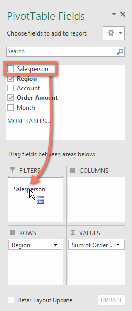
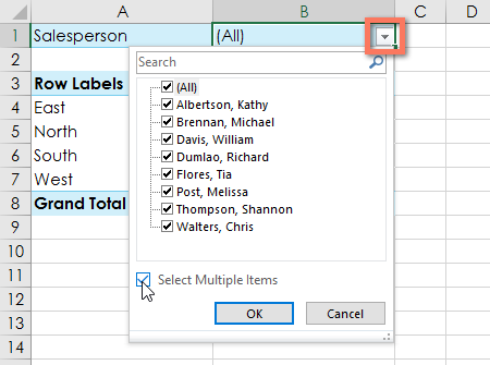
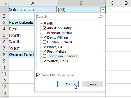
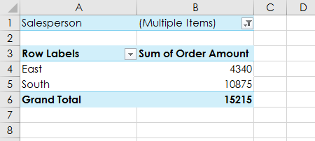
Sometimes you may want focus on a certain section of your data. Filters can be used to narrow down the data in your PivotTable, so you can view only the information you need.
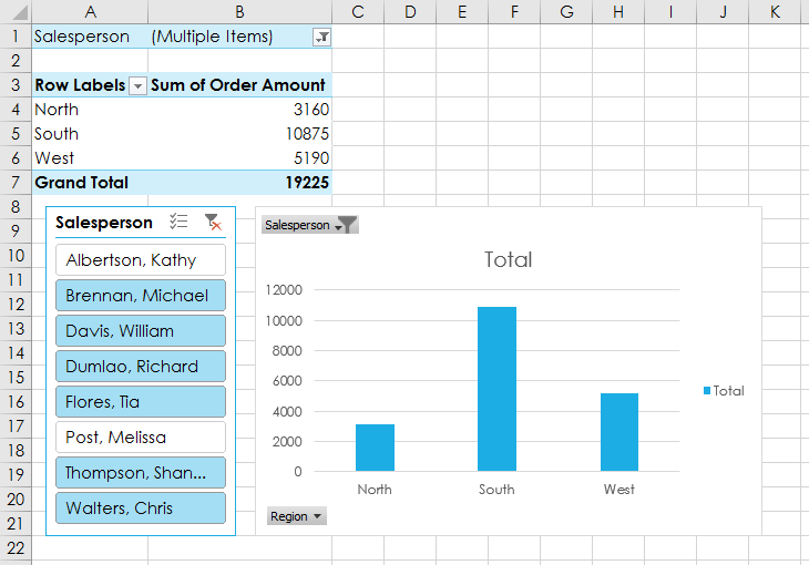
In the example below, we'll filter out certain salespeople to determine how their individual sales are impacting each region.
Slicers make filtering data in PivotTables even easier. Slicers are basically just filters but are easier and faster to use, allowing you to instantly pivot your data. If you frequently filter your PivotTables, you may want to consider using slicers instead of filters.

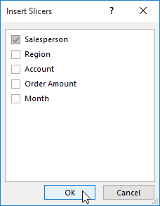
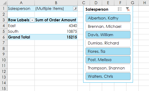
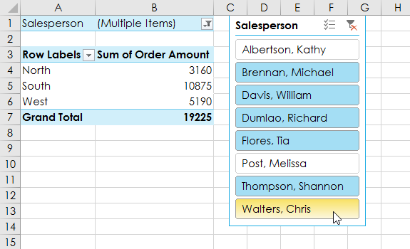
You can also click the Filter icon in the top-right corner of the slicer to select all items at once.
PivotCharts are like regular charts, except they display data from a PivotTable. Just like regular charts, you'll be able to select a chart type, layout, and style that will best represent the data.
In the example below, our PivotTable is showing a portion of each region's sales figures. We'll use a PivotChart so we can see the information more clearly.

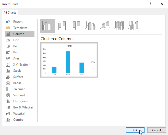
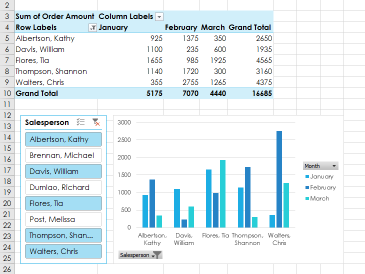
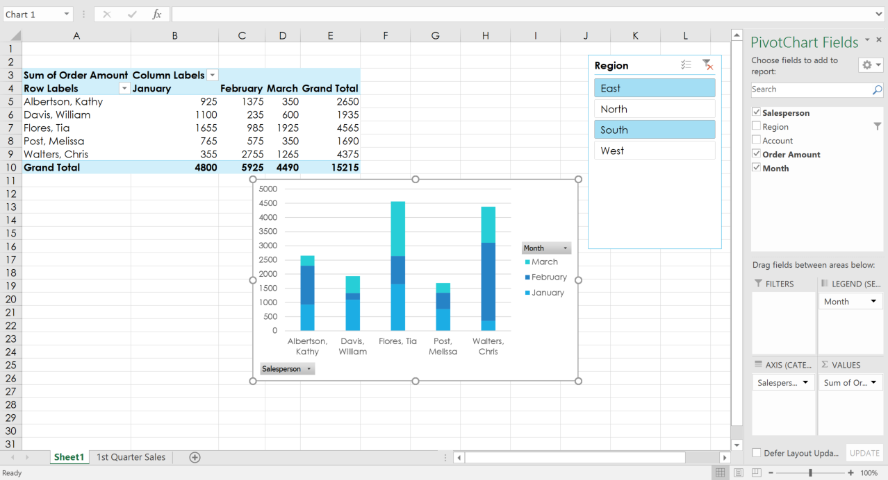
Try using filters or slicers to narrow down the data in your PivotChart. To view different subsets of information, change the columns or rows in your PivotTable. In the example below, we've changed the PivotTable to view the monthly sales for each salesperson.
/en/excel2016/whatif-analysis/content/